COMP 3: Final Piece

This blog post contains the final product of our music video and promotional package containing a digipak and social media. Written by me (Timothy).

Music Video

Use this link in case the video is removed from YouTube: LINK

DigiPak

Front Cover

(Inside) - Tracklist & CD Page

Back Cover

Mockup

Social Media

Here is a link to our live social media account: https://www.instagram.com/kiaraa_music/

social media username and home page

overall layout

interactions with fans (1)
interactions with fans (2)

COMP 3: Critical Self Reflection

This blogpost contains my critical self-reflection for Component 3, written by Timo. 

In this essay, I will be looking more closely into the pre-production, production, and post-production process of the creation of our component 3 where we, as a group of 4, were tasked to create a music video, as well as a promotional package, including a digipak and a social media page. 

In order to accurately target the correct audience we had to consider various factors during the process of our pre-production, we had to choose a song along with its genre, and with this, we decided to choose a song titled “Feather” by Sabrina Carpenter, an upbeat pop song that talks about a post-breakup life, where after cutting ties, she feels much lighter and freer without her ex-lover. This can be seen as a current social issue that we want to shine a light on with our project, as society nowadays faces issues where they are attached to past lovers and develop problematic obsessive issues. We wanted to focus on specific social groups, such as teenage girls and Asians, which we can enforce by using the proper representations in our music video. This was done by using an entirely Asian cast, as our lead actors are of the same social group as the demographic we are targeting, it allows the audience to empathize more with the actors as they feel represented, another aim is to raise awareness and popularize the representation of Asians in the media industry. With this we decided on a general theme and mood both our music video and promotional package will follow, we chose a more bright and fun theme creating a lighthearted mood. After conducting research, we decided that a performance-based music video would be more suitable for our project as we want to show the actor’s expression and emotion through the enjoyment of music. Furthermore, our digipak research helped us develop the right typeface and layout, deciding that a handwritten typeface would be more suitable as it will seem more personal, this will allow for the audience to feel a connection with the artist.

During the process of production of our music video and promotional package, there are plenty of things that we considered to further improve our project. In our music video, there are various uses of media language that emphasize the different stereotypes, mainly stereotypes of girlhood and players or womanizers. The mise-en-scene we used played a big role in the portrayal of our male lead, who represented a player, we did this by using the proper costume design, as we conformed to general conventions of womanizers, dressing them up in leather jackets, chains, and gelled hair. Furthermore, our male lead was carrying a bouquet of red roses which connotes love, this helps the audience understand the intent of the male lead. Additionally, we also conformed to stereotypes of girlhood, where we used props that were generally beauty products, such as makeup, straighteners, and hair dryers to depict scenes of them getting ready. On the other hand, the use of camera angles proved to be very useful in portraying representations in the project, the most prominent camera angles used in the music video were close-ups and wide angles; the use of close-ups makes the audience feel more connected with the media as they can analyze their expressions, whereas, wide angles were used to connote freedom to further emphasize the representations of girlhood. The actors’ performance was vital in setting the right tone which is why while directing this music video I always emphasized happiness and energy. All of these aspects of mise-en-scene create the perfect representation of what we want to portray in the music video. As both the writing and directing were done by men, this video could also be said to be produced through the male gaze and it in fact does follow conventions of this, where our video uses slow motion of the girls and close-ups of their features. With our social media page, we created posts that would engage with the audience, according to Richard Dyer’s theory of stardom, an audience engages with an artist’s ordinariness and consumption, with this we created an interview video of our star KIARA enjoying regular, everyday tasks such as drinking a matcha latte to post on our social media. We created this post whilst still following the theme and mood of our product, using bright colours, an open location with a scenic view. Consistently using and following the right theme and mood across all our products creates a sense of branding, this allows for the audience to feel a sense of loyalty and familiarity, which keeps the audience engaged. All the images used for the digipak were all taken in the set of our shoot, this can give the audience a more immersive experience, giving them a deeper look into our artist’s world. All of her posts on social media paint her as the perfect radiant girl, which is exactly how we imagined KIARA from the start.

Seeing that the process of pre-production and production can create a large impact on our product, I realized that it can be further enhanced through post-production. After getting all the necessary shots needed for our music video, editing played a big role in targeting the correct audience. Firstly, shooting at outdoor locations resulted in a variety of different lighting conditions, and color grading, provided consistency throughout the whole video; color grading improves the product visually to make it seem more appealing. Secondly, we used a few different cut techniques, which include, jump cuts, and punch-in cuts. Jump cuts were used to show a long action in a short amount of time, this seemed to be a running issue in this project because the song is quite short, whereas, punch-in cuts were used to direct the audience’s attention toward a certain action, as this is a performance-based music video, putting emphasis on their expressions and dance moves can help the audience understand our product with ease. Lastly, slow motion editing was arguably the most used in this product, this is because slow motion makes an ordinary task seem more graceful, it can be directly correlated to the lyrics, “lighter like a feather”, the slow motion video makes the audience feel lighter because of the surreal and dreamlike effect it creates. Our social media engages with the intended audience through various different methods. Nowadays, songs become famous overnight because of dance trends, seeing this we made a dance challenge that the audience could keep up with, whilst promoting the song. Furthermore, we included direct artist-to-audience interaction, such as replying to fans’ comments and hosting Q&A sessions. 


Comp 3: Post Production

This blog post contains the post-production process of our music video. Written by me (Timothy)

To begin, I opted for Adobe Premiere Pro CC 2020, a timeline-based and non-linear video editing software application, as my primary tool for video editing due to its comprehensive features and interface I was already familiar with as I have used it for over 3 years. After each day of filming, I established a habit of managing my files by transferring the necessary clips and images from the SD card to my desktop, ensuring a streamlined editing workflow. Once imported into Premiere Pro, I filtered the shots, eliminating any footage deemed irrelevant. The software's intuitive design facilitated the synchronization of clips, with the marking feature being very useful. This feature allowed me to label specific points in the timeline, enhancing precision and efficiency in the editing process. 

Shown below is the overall timeline of the project:

As seen in the image above, the use of markers proved to be very useful. Since I am editing a music video for the first time, the process of doing so requires a new step that was previously foreign to me. Before importing any clip into the timeline for an edit, I needed to sync the scene to the music. This is because a slight delay would be very obvious, especially in scenes where there is a close-up of an actor lipsyncing to the camera, a slight delay of a few seconds would make the product look ugly and unprofessional, which is why I had to be very detailed when syncing clip audios to the song. However, during our filming process, we had a clapboard which made it easier to sync clips, because the audio in the timeline would have a spike because of the loud sounds, giving me a guide on where to cut the clip. An example of this is shown in the image below:


SIGNIFICANT EDITING CHOICES AND METHODS

Colour Grading (Lumetri Color)

before colour grade

after colour grade

color wheels in premiere pro

Knowing that we have a theme and color scheme to follow, I saw that the raw clips were far from the right color to portray what we wanted, with this, I spent hours colour grading the clips to find the perfect balance between warmth, saturation, and exposure we wanted. I believe that the colour grade I created portrays the perfect amount of warmth that is felt when friends get together, just like the scene depicts.

Speed Ramping (Time Remapping)

example of a clip that uses speed ramping (2:43-2:47)

speed ramping keyframes

Speed ramping is a technique of smoothly transitioning between different playback speeds within a single clip or sequence. This allows for dynamic changes in speed, creating visual interest and emphasizing specific moments in a video. This method of editing was done in three steps; in the timeline, position the playhead where you want the speed change to begin. Set a keyframe for the Speed/Duration option in the Effects Control Panel. Move the playhead to where you want the speed change to end and set another keyframe. Then, change the speed value between the keyframes to the desired speed.  You can then adjust the bezier handles on the keyframes to control the easing in and out for a more gradual speed change. Overall, the use of speed ramping was very useful in creating emphasis, and adding drama to a simple action. In the clip above, the girls are seen to be opening a picnic blanket, with speed ramping, a simple action can become very visually pleasing.

Jump Cuts

scene that uses jumpcuts (1:12-1:18)

jumpcuts in timeline

In this music video, jump cuts are utilized to adjust their actions to the pacing of the music. By identifying static points in the footage where minimal changes in framing or camera position occur. I used the razor tool to cut the clips at these jump-cut points and arrange the remaining sections consecutively on the timeline.

Reflection: During the editing process, I faced many issues where my files disappeared or were corrupt. The editing software itself also crashed multiple times as I threw high-resolution 4k footage for it to process. However, through this editing process, I learned many new things. Editing techniques used in other videos don't always work in music videos, this forced me to do research and learn more techniques that would be useful in this project. Lastly, spending so much time colour grading allowed me to find a colour theme that I like, whilst still applying to the style and colour scheme we planned. In future projects, I would find more ways to further streamline the process of editing, since I spent so mucn time experimenting during the process of editing this music video. I would hope for future projects to be edited more efficiently. Overall, this post production process has taught me patience, whilst testing my ability to quickly learn new techniques.

COMP 3: Behind the Scenes

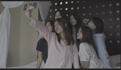
This blog post contains the details of our production or filming process of Component 3, written by me (Timothy)

Pictures taken behind the scenes were mostly taken by Nayana and Sharon, compiled by myself. During the filming process, we initially planned to shoot for only 3 days, however, we then added a day due to unforeseen issues that will be detailed in this post. 

DAY 1 (Beach Scenes)

Me (Timothy) directing the cast

Outdoor scene with reflector

Shooting the performance scene

On the first day of shooting (January 27th), we were shooting all the beach scenes. We arrived at around 1:00 PM due to high traffic, which was an hour later then what was initially planned. This meant that we had to efficiently shoot all the scenes. When we arrived at Gunung Payung Beach we shot a few scenes in their car park of our star exiting the car. We then moved to the beach location when problems arose.

Problem: The main problem we experienced this day was that we were forced to leave Gunung Payung Beach because we required a permit to shoot there that costs a total of IDR. 750,000. We were never informed of this during the scouting process so we were caught blindsided. Furthermore, our screenwriter wasn't present as he was abroad, however, it didn't cause that much of an issue as I was able to direct the talented cast with ease. Our team also lost our speaker, which made it hard for the actors to hear the music to perform to in such windy conditions.

Solution: We moved locations to Pandawa Beach, located only a few minutes away from Gunung Payung Beach, we thankfully didn't need a permit to film there as we only needed to be nice to the locals. After losing the speaker, we used the loudest handphone setting and hid it in between the cast to make sure they can hear the music they have to perform.

The shoot utilized simple equipment including:
  • Camera (Sony A7III)
  • Standard Zoom Lens (Zeiss 24-70 F4)
  • Wide Angle Lens (G-Master 16-35 F2.8)
  • Reflector (GODOX RFT-02 Light Reflector Disc)
During this shoot, the two lenses used perfectly created the variety of shots we needed. The standard zoom lens we used allowed a variety of portrait shots that we close-up (used for our performance scenes), and the wide angle lens was great in creating an image of our scenic view (used in landscape scenes). However, because this was an outdoor scene, the lighting on our cast would be very imbalanced and would have very harsh negatives (dark shadows), using the reflector was very useful because it helped bounce the sunlight to give our cast an even light distribution, which created the best image possible. The reflector was held by our crew members who helped with the shoot.

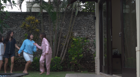
DAY 2 (Villa Scenes)

Shooting scene with practical effects

Setting up gimbal (stabilizer)

Shooting intro performance scene


On the second day of shooting (February 3rd), we shot all the scenes required in the villa. The plot of these scenes is that KIARA and her friend are getting ready as it showcases the villa they're all staying at. To get all the shots we needed, we needed to start the day early to shoot more efficiently, which is why we planned to arrive at 11 AM. We planned this to capture the perfect lighting as if they had just woken up.

Problem: The first problem we had was that everyone arrived quite late due to extreme traffic conditions. This means that we had less time to utilize the natural sunlight, although we brought a lighting panel, the battery only lasted for a few hours which was a huge shame. Furthermore, the original villa was unavailable as it was fully booked, which means that the villa we got wasn't to our original expectation. Lastly, we weren't able to capture any sunset scenes due to poor weather conditions. 

Solutions: Arriving late means we had to be extremely efficient with the little time we had, with little sunlight we utilized the lighting panel we bought. Furthermore, we replaced the scenes that needed parts of the villa that were unavailable with scenes we deemed appropriate. Lastly, we replaced the scenes that require a sunset with scenes from the beach and park.

The shoot utilized simple equipment including:
Camera (Sony A7III)
Standard Zoom Lens (Zeiss 24-70 F4)
Wide Angle Lens (G-Master 16-35 F2.8)
Light Panel (GODOX LEDP260C)
Gimbal (MOZA AirCross 2)

During this shoot, I mostly used the standard zoom lens as we shot a lot of high-action movements, such as the pillow fight scenes. Zooming in from a further distance allowed me to capture the movements whilst still being at a safe distance where the camera or myself isn't harmed in anyway. Furthermore, the my gimbal proved to be very useful as it allowed me to follow and pan along with the actors high-action movements whilst creating a stable and presentable image. During a few scenes, I had to tweak with a few settings on my camera to be able to shoot in 200 frames per second. This allows me to slow it down in post to allow for a slow-motion shot. This was extremely useful in the scene with practical effects, making it all the more dramatic.

DAY 3 (Car Scenes)

Shooting POV car scenes

Shooting follow car shots

Experimenting with follow-shots

On the third day (February 8th), we were planning to shoot both the car scenes (Griya Alam Pecatu) and the scenes at the park (Peninsula Island). These scenes were supposed to showcase the girls' journey to both the beach and the park. Whereas, the park scenes were supposed to be the girls having fun and joking around whilst having a picnic. On this day, everyone arrived on time at 12 PM, we then shot all the car scenes, which finished around 3:30 PM, and made our way to Peninsula Island Park, arriving at around 4:30 PM, due to condensed traffic, where we then faced more problems. 

Problems: During the filming of the car scenes, our time was cut a bit short as a security guard approached asking about a filming permit. When we arrived in the parking area of the park, it was raining very heavily, which meant that we had to wait for it to die down. Furthermore, upon arriving at the second location (Peninsula Island), we were approached by security once again saying that any form of videography or photography with a professional camera is strictly prohibited. This was another rule we weren't aware of when scouting this location. Lastly, as the shoot was delayed due to the rain we didn't have time to move locations in a last-minute manner like we did with the first day of shooting.

Solution: When asked for a permit, we emphasized that this project was not for any sort of commercial use, we then were allowed to continue shooting on this private property (Griya Alam Pecatu). After finding out that we weren't allowed to shoot at Peninsula Island, we decided to reschedule our shoot for the following week (February 13th) at Lapangan Renon, right after we finished school on that day.

The shoot utilized simple equipment including:
Camera (Sony A7III)
360 Camera/Action Cam (Insta360 X3)
Standard Zoom Lens (Zeiss 24-70 F4)
Wide Angle Lens (G-Master 16-35 F2.8)
Gimbal (MOZA AirCross 2)

During this shoot, the gimbal's stabilization was a key factor in capturing the car scenes as it helped stabilize all the shots as we followed them at high speeds. Furthermore, the use of the standard zoom lens allowed for a variety of shots from closeups, to full shots. Another way we shot this car scene is by using an action cam, in this case an Insta360, which was mounted on to the windshield, this perfectly captures a wide angle of everyone in the car. I had the idea of this shot after watching James Corden's carpool karaoke series, this shot gives a more inside look into the car. Prior to the shoot, I purchased a polarizer for my lens which is supposed to allow me to shoot through my car's tint on the windshield to create a clear view of the cast. However, the reflection and tint was too strong, which is why we opted to use the shots from the Insta360 instead.

DAY 4 (Park Scenes)

Shooting a follow scene

Shooting a transition

Shooting a close-up

On the fourth day (February 13th), was the quickly planned park day, on the final day we filmed shots where we could see our actors having fun and playing around whilst having a picnic at the park. Shooting on a school day meant that we had to rush there as fast as possible to avoid school dismissal rush hours, we arrived at the park at around 4 PM, this was the only day where we didn't have any major issues allowing us to finish on time at 6 PM before the sunset.

Problem: The only main problem we had was that we couldn't stick to the screenplay exactly to a tee, this is because, initially we planned to shoot a sunset scene on Peninsula Island, which is impossible to do at Lapangan Renon because of its location. 

Solution: We replaced these scenes with other scenes we deemed appropriate, creating a similar effect in the audience.

The shoot utilized simple equipment including:
Camera (Sony A7III)
Standard Zoom Lens (Zeiss 24-70 F4)
Gimbal (MOZA AirCross 2)

During this shoot, my gimbal unfortunately died because it ran out of battery, this means that a large portion of the shoot was shot handheld, and because of this, I minimized shots that require quick and stable camera movements. I instead focused on static shots, that required utilizing the actor's movements. A highlight during this shoot, was when I had to lay on the ground to get a shot of the picnic blanket opening and then covering the camera, this was done in order to get a shot for a transition. The props were also a big part of this scene, utilizing the picnic basket and picnic blanket to create conventions of picnic scenes.

Reflection: The production process of this project required the most time and effort when compared to other components during my studies. This is because it required extensive amounts of planning and this project is done on a larger scale, containing more people. During this production process, we were backed into a corner on almost every single day of filming, and this helped me improve in thinking of quick solutions. With this, I realize that when you are creating something with so many moving parts, not everything will go to plan, learning not to give up whilst facing huge drawbacks improves my character. Overall, I am proud of my team and myself for what we accomplished during the shoot. In the future, I now know to always check for filming permits and to always have backup locations. I can also improve in punctuality, as I was late for the shoots.

COMP 3: Social Media Development

This blogpost contains the research and development of our social media page, written by me (Timothy).

Research

Tate McRae

Looking at Tate McRae's social media page, I can see that her posts all follow the same theme of her wearing revealing outfits for magazine photoshoots. With her pinned posts being promotions for her album, song, and world tour schedule, this helps direct attention from the audience to the most important part of her work as an artist. This can be an effective way of promotion, as this is the first thing an audience sees, She also has posted videos of her performance, and a video to tease a song, this can create anticipation in audience making fans more intrigued and excited over an upcoming release. She also posted pictures of her backstage from her live performances, this could give the audience an inside look in her life, which can feel more personal to keep the audience engaged. The use of revealing clothes in her social media can be seen as a way to attract a male audience. Overall, Tate McRae's social media page follows a consistent theme, which she knows is effective to her own audience, averaging around 300k likes per upload. I personally like the consistency throughout her theme, even though it is slightly vulgar.

Dua Lipa

Looking at Dua Lipa's social media page, in recent times I can see that she follows a consistent colour theme, this is because it revolves around her new single "Training Season", using the colour red as a base colour in all her posts. Prior to the release of her new single, she posted everyday, 7-days a week straight to build anticipation and excitement in her audience. She also uploads funny videos, this can be seen as an aspect of ordinariness, because although she is an artist, she still does ordinary things, which can keep an audience engaged. Furthermore, the captions used in her social media posts are also very simple. Similar to Tate McRae, Dua Lipa's social media page also utilizes pictures of her performance videos as well as a look in to her life backstage before going to perform, this also creates a more persona feeling, which could lead to the audience feeling more of a connection with the artist. Overall, I like how she posted daily to hype-up the release of her new single, I also like the consistency of the colour scheme. I also think there is a perfect balance between professional and personal posts.

Layout Planning

Before creating any digital designs for our social media posts, Nayana sketched out a rough draft of our social media page layout after discussing it with our entire group. The draft is in the image shown below:

According to Richard Dyer's theory of stardom, an audience is attracted to their star's"ordinariness". which is essentially their stars living regular daily lives just like everyone else. Knowing this, we designed our social media page whilst keeping this theory in mind. This can be seen in our '10 Questions with Kiara' post as well as our 'BTS shoots' posts which allow for a closer look into our star's daily life.

Nayana created all the social media posts which can be seen in the image below:


SIGNIFICANT SOCIAL MEDIA POSTS

'Feather Teaser Video'
One of our main posts is a teaser video, which acts as a promotional tool to generate interest, excitement, and anticipation for the upcoming music video. It's a strategic way for artists to connect with their audience, build momentum, and create a buzz around their new release. I edited this video in Premiere Pro, using clips that will be seen in the final music video, l also added the release date and a title card

The audio used in the teaser was edited by Nayana, using audacity, where she added sound effects of ocean waves crashing along with the instrumental of the song 'Feather', using only one line which proved to be very impactful in the audio which was "I'm so sorry for your loss". This was the perfect amount of balance between music and line delivery to create a sense of interest and anticipation in the audience. Shown below is the image of the timeline in the editing software Nayana used to edit the audio:


Final Post:

'Feather Dance Challenge' 

We then created a TikTok dance challenge for our song, which was inspired by an existing dance challenge. We did this because TikTok dance challenges are a powerful and fun way for artists to leverage the platform's features to promote their music. By tapping into the viral and interactive nature of TikTok, artists can create a buzz around their songs, engage with fans, and potentially propel their music to the top of charts and playlists.

Shown below is an image of me recording their TikTok dance challenge, using the TikTok app:


Final Post:

'10 Questions with KIARA'

 This social media post was heavily inspired by Vogue's interview video concept, which is the '73 Questions' series usually done with large celebrities. 

Doing a similar concept will allow the audience to learn more about KIARA, whilst feeling a more personal connection with their star. With this, Nayana and Maxi came up with questions that aim to highlight the KIARA's personality, which include:

  1. From 1-10, rate how excited you are for your upcoming album release!
  2. What is one drink you can't find yourself living without?
  3. What is your New Year's resolution and have you stuck to it so far?
  4. What is your current favourite social media trend?
  5. What is one must-have item for you when you go travelling?
  6. What is your comfort food?
  7. Out of all the spots in this set, which one's your favourite?
  8. What is the most precious gift you have ever received?
  9. What is an activity you love to do during your free time?
  10. Lastly, give us a short message for all the fans who are watching right now!
The answers for this video were scripted and written by Maxi, which include:
  1. gotta be a 10! i’ve put in so much work into this and i hope y’all are all as excited as i am!
  2. ⁠matchaaa!! (she can hold the drink while were at it)
  3. ⁠well, i’ve been trying to get to school on time more often and uhm, thats going about as good as u’d think it is)
  4. ⁠uhmm, (whispers) dont tell anyone but… the dont go insane trend by dpr ian…
  5. ⁠can’t leave this island without my film camera!!
  6. ⁠hmm… tough question! i think nothing could beat bakmie after a long day of school though!
  7. ⁠oh c’mon, it’s gotta be this absolutely beautiful view, just look at it! (points towards view from house ledge)
  8. ⁠actually, i’m wearing it right noww, this necklace was given to me by my dad, back when he was still with us, and i’ve never taken it off ever since
  9. ⁠hmm, good question, i think either dancing, or watching musicals have to be one of my favorite things ever though!
  10. ⁠thank you guys sosososo much for watchingg, and dont forget to save March 3rd onto your calendars! see you guys soon! love youu! (blows kiss)
However, as I was directing I told the star to not fully stick to the script as it wouldn't be very natural of her and it can be very difficult to memorize a lengthy script. With this, our star remembered the main points of each answer and replied according to her own personality. Nayana filmed this, while Sharon was the one interviewing our star.

Final Post:

Reflection: Creating the content for this social media page helped me understand how to create a sense of branding in our artist. When I was editing the teaser for the music video I struggled to find the perfect clips that display the perfect balance between creating anticipation and showcasing performance without spoiling the song. Furthermore, taking photographs for social media was quite difficult as it shouldn't look too professional as we are aiming to target the audience through our star's 'ordinariness', I overcame this by either taking pictures without a professional camera or using other methods of composition. In future projects, I would like to create a social media page with a more professional layout, to challenge myself.

COMP 3: Digipak Development

This blog post contains my research along with the groups development of our digipak, written by Timo

Research

Since our project revolves around a female pop star, I proceeded to conduct research on female artists' digipaks that followed the same genre. These artists include, Im Nayeon, Dua Lipa, and Kim Jennie. The following digipaks are example of what I believe is a similar theme and mood to what we want our digipak cover to be.


I personally like portrait shots of artists on the digipak cover because it feels much more personal and give a form of interaction with the audience. I like that the poses they are doing in the cover do not seem very monotone and have some sort of uniqueness to it, with Nayeon (most left) the dress and shiny accessories standout, with Dua Lipa (middle) the bar shes hanging on adds another layer of depth to the design, and lastly Jennie (most right) has a bright pink flower that glows. I personally like the idea of not only having the subject artist stand out.

On the other hand, Nayana also conducted research, finding pictures in pinterest she deemed the most fitting for our concept. I agreed with Nayana, since the pictures she chose perfectly encapsulates a senso freedom, whilst still being elegant and simple. Nayana's research seem to follow a earthy or natural colour pallete, whilst having the subject either look away or directly at the camera. This research is shown in the image below:


Layout Planning

Before digitally developing our digipak, Nayana sketched a rough plan on paper creating a 4-page layout of a:

  1. Front Cover
  2. Tracklist
  3. CD
  4. Back Cover, containing:
    • Hand Signature
    • QR Code
    • Barcode

Below is the sketch/draft Nayana created for the layout

Digipak Front Cover

Using Canva, we (Timo, Nayana, and Sharon) created a large variety of different mockups, utilizing different typefaces, compositions, sizing, and colours, using the same picture. After further discussion, we all agreed on one typeface called "Moontime" (circled in green), which was used as our main digipak cover font as well as our title card in the music video. It encapsulates the perfect amount of elegance, whilst still being personal as it looks like a handwritten font. Shown below, is the compilation of mockups, compiled by Sharon.


However, after further analysis, we decided that the original picture used was a tad bit too bland and didn't represent exactly what we wanted it too. The pose itself is very monotone, therefore, we conducted another photoshoot experimenting with different poses. 


With the first three rows of our mockups, we chose a beautiful image of our star facing away from the camera, reaching to the sky. I believe that this image was a good choice to use as a base for our design because it gives a bit of mystery and really shows her freedom when she is reaching to the sky. Whereas. the final row of mockups uses a portrait image of her facing straight towards the camera, which is popular with indie artists, this can give the audience a more personal feel as she makes direct eye contact with them. However, what these two images both have in common is that the background mostly consists of either the sky or the open ocean. This connotes freedom as there is so much free space behind her almost as if she is flying or soaring.

With the first image, we finalized our layout with the title text being at the bottom, this is because this is the most optimal position for the text to stand out, as other positions would make the colour pop out less. However, we made a lot of trials of placing different writings on top of the cover, this is because the composition would feel imbalanced without anything on the top part, therefore, we experimented with adding her name "KIARA" in a bold font, testing different colours, such as different shades of blue and even green. Furthermore, we added "The 1st Mini Album" as writing to emphasize our artist's debut album, however, our media teacher disliked the font we used as the text saying the "1st" was easily misread as "ist", we then finalized a font which eliminates this problem. Below it we also placed a copyright text which was used to further balance the layout, to not make the space feel too empty.

Final:

The picture shown above is our final front cover for our digipak, we decided not to change the font above despite our media teacher's feedback as it adds the perfect balance of simplicity. Using green as the font colour also helps with continuity as the inside of our digipak uses these colours.

Tracklist 

Below is the tracklist Nayana created, in which she combined the actual artist's, Sabrina Carpenter's, songs as well. Short song titles are seen to be more popular with modern artist's which is why we chose this as our tracklist.

  1. Just Say Yes
  2. Feather
  3. Nonsense
  4. Actin'
  5. Boy(friend)
  6. Nowhere Near
  7. Idyllic


Shown above is a compilation of our (Timothy, Nayana, and Sharon) mockups made in Canva. I personally designed the tracklist layout adding a text below the title of each song showcasing its producers and writers below it to give it another layer of design, which was heavily inspired by K-Pop albums, as this design language is popular in that industry. My text design was finalized as everyone in our group really liked it. Our tracklist title font changed multiple times as we experimented with blending two different fonts, however, we agreed with our media teacher's feedback to change it as it seemed too excessive. With our tracklist page image, we experimented with different pictures we took at both the park and the beach, however, we had two main options which were either a scenic background or a picture of the artist looking at the tracklist. Firstly, we eliminated using a scenic background as it was a bit too empty, and the text was hard to read if the background was bright. Secondly, we experimented with adding a colour block behind the tracklist to make the text more visible, however, it seemed dull and quite unprofessional which led to us deciding to not use it. Lastly, we decided to use the pictures at the park, changing the colour scheme to green and brown, as this would make the text more visible. 

Final:


As a group, we believe this tracklist page is perfect as the image of our star with her hair flowing in the wind perfectly represents her freedom, accompanied with her expression, smiling with eyes that glow, showcasing how happy she is after letting go.

CD Page

Shown above is a compilation of mockups for the CD page made by Sharon. Using different pictures of scenic backgrounds from our set, including the sea, and the sky. However, the colour tone was not satisfactory as it didn't give much detail to the clouds.

Final:


Shown above is the finalized CD page, using a photograph I took at the park of bubbles floating at the park. I think this image is the perfect choice bubbles float effortlessly, carried by the air. This lightness can represent the feeling of freedom, as they are not weighed down by gravity or constraints. The carefree movement of bubbles through the air can evoke a sense of liberation. The bubbles weren't placed in the middle to make it seem as if the bubbles were carrying the CD, whilst making it seem natural.

Back Cover

Shown above are the mockups of our back cover page compiled through Canva. We first used a simple image of our star with her back turned away from the camera. We then experimented by adding a barcode, which is commonly found in most artist's digipaks. We then added the artist's name to give more exposure to her, for curious audiences. Lastly, we added an anecdote, which was written by Maxi, after researching different artists' "about" page in spotify. 

Anecdote:
"After rising into the limelight of public attention at the age of just 13, 17-year-old Indonesian singer-songwriter KIARA continues to push the boundaries of what the music industry considers feasible. Feather - her newest album - debuted at number 1 on the Billboard Hot 100 in 32 different countries. Hailed by both the public and the industry alike as one of the most creative and inspirational talents of her generation, the end of KIARA's rise to stardom is seemingly nowhere in sight."

Final:


The image shown above is our finalized back cover. I think that anecdote used in this back cover is the perfect length and detail to give information of our star, KIARA. Using the image of her facing away also gives an effect of a dramatic and grand ending, perfect for our back cover.

Reflection: When creating this digipak, I was not really supposed to work that much on it, however, as we began to develop the different pages, I couldn't help but to put effort into it. Working together with Nayana and Sharon helped me improve my designs as their feedback was really helpful. I learnt how to make different fonts of different typeface families work well with each other. I learnt how to compose different layouts to make the perfect balance of dividing attention between the title and our star. Using canva was also really helpful as we could collaborate on a design in real time. Following this project, I need to do more research on digipaks to broaden my style because I feel like I followed a certain style as I was afraid to try something new.